Lean

You are currently browsing articles tagged Lean.

Kanban boards

Here are some examples of Kanban boards I built for a friend. I was not coaching these teams, so I did not have any say on the process. My job was simply to build a board that would reflect their current process, using my Visual Management guidelines.

These boards are for a corporate unit that acts as a sort of “enterprise proxy product owner”. They receive business demands from multiple business units, they analyze and classify them, and make a proposal to the customer. They also make recommendations such as build or buy. If the proposal is approved, they send it to development and follow it up into production.

For my first attempt, I was told that there was a special state that had to be highlighted: the “GO/NO GO” state, where a proposal is waiting to be either approved or rejected. So I built this board with a red swimlane to hold kanban cards in that state:
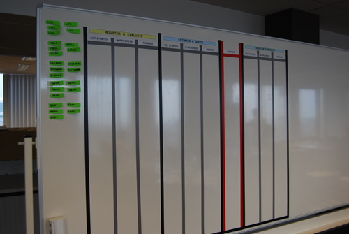
Kanban board with go/no go

I was very happy with this solution from the visual point of view. Unfortunately they realized that it did not reflect their process accurately so I was asked to tear it down and start over again.

For the next iteration, They identified four states where something vaguely resembling single-piece-flow should theoretically occur. The four states are “quotation” (yellow) , “study” (blue), “contract” (green) and “execute” (red). The colors are the background color I chose as a title for the swimlane to visually distinguish it. For each state, there are three sub-states that are not always the same. This is what a finished board looked like:
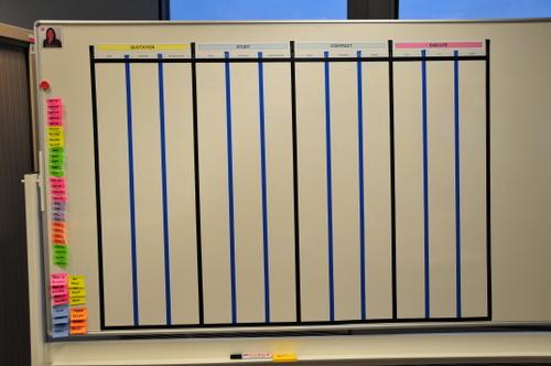
xqa_0756-1

Note that I used different colored tape to indicate internal columns from state-boundary columns. In the first board I had used gray tape, which I like more than the blue tape in this picture because it connotes better the idea of sub-columns.

These boards were accepted and populated with kanban cards. Each card is a Super Sticky Post-It, representing a customer demand as it flows from being submitted by the business to being deployed into production. Note how immediately upon populating the board the bottlenecks became visible. This board represent the initial state this team was in when they decided to visualize their workflow.
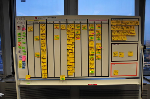
xqa_0761-1

They also put some sections out of the swimlanes for special things. For example jobs that get cancelled or sent back to the business. Those are the boxes you see on the side.

Here is a closeup of the main part of the board.
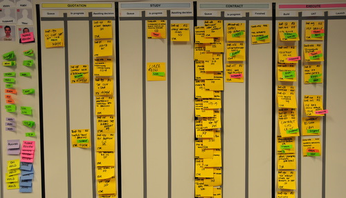
xqa_0762-1

toyota-waterfall

Mary Poppendieck, Henrik Kniberg and a bunch of other people are on a Lean Tour in Japan that might turn out to be historical.  According to this blog post, a Toyota software development manager has spoken openly for the first time on how they develop software, and guess what? Yep, it’s waterfall. We’re waiting for more details on the Lean Development list regarding how they manage to pull this off and what they think of the Agile community, but I think we’re going to learn a lot here.

Update 2/May: this is what Mary says about what Toyota is doing and thinking

The person we heard from at Toyota – Ishii-san – deals with embedded software in production automobiles.  I understand that for a prototype part, software can take a matter of days.  In production parts, the cycle was 3 months.  When you are dealing with embedded software in production hardware, a 3 month waterfall is really fast.  And note that at Toyota, people really do talk about “bad news first”, so what we heard about is what they consider a problem, as opposed to what is going well.


To answer your question about agile, Ishii-san said they are studying agile, but their architecture is not particularly supportive of it.  His real motivation, as I heard his comments, is that improvement is necessary because of the late detection of defects.  I imagine that they will focus on early removal of defects, and adopt whatever processes prove (after PDCA cycles) to be more proficient at doing this.


Toyota people will not just do agile because someone says it is good.  They will look at their objectives and adopt whatever process gives them more of what they consider good.  And Toyota is  VERY good at doing this – I would not want to be competing against them!


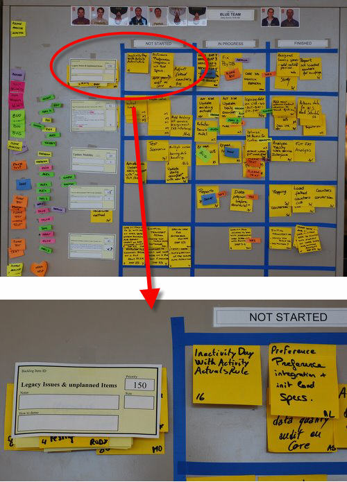
“Unplanned items and legacy issues” is the top row on my scrumboards. Instead of a story, it is a placeholder for:

  • Unplanned work: stuff that we suddenly have to do and we can’t plan (meaning we cannot put into the backlog as a story). A typical example is reinstalling a PC after a hard drive crash. You might spend all day at this, and you are obviously not going to wait until the next sprint to fix your PC.
  • Legacy issues: this is any bug or issue that belongs to stories already delivered and accepted, and should be fixed.

Why do I put this on top? For unplanned items it’s rather obvious: this is for things you are doing anyways, and are not part of any story. Most teams simply don’t visualize this type of work, but I like all work to be visible, even if it doesn’t add value. Otherwise the day is gone and “nothing” was done. This way at least everybody knows what you are doing.

Regarding legacy issues, a general best practice is to fix bugs before writing new code, and implement all feedback from the Sprint Demo before starting with new stories. If you follow those guidelines, legacy issues should have priority over new work.  (If for any reason it doesn’t, then put it either in the backlog or in the parking lot).

In both cases, we are assuming the work is relatively small. That means tasks, not stories. At most a couple of days of work.  For example, during the Sprint demo, the customer might make a small observation that takes one or two hours to fix. A small change request if you want.  How are you going to manage this work? Are you going to create a new story for this? Too much overhead… just put up a task (a post-it) in Legacy Issues, get it done with and forget about it. But be careful with this and always use common sense. If it is story-size work, there is really no excuse not to plan it, it is the PO’s responsibility to tell the customer it will go in the backlog and the best he can ask for is top priority for the next sprint.

legacy_unplanned

Status Tags and the Three Columns

“Less is more”. You heard this before, right?

This applies particularly to visual management. It is very easy to generate noise by creating visual elements that are not strictly necessary. When designing our information radiators, we should always be careful not to create waste. And any visual element that doesn’t add value is waste.

Of course, sometimes it’s not that easy to figure it out. For example: suppose you run out of yellow Post-it’s, and you see some green Post-it’s lying around. Should you use them, or is this waste?waste

By using another color, you are creating “something”. There used to be one color, now there are two. People will look at the board and wonder: “What does green stand for? What’s the difference between green and yellow?”. And there is none, you were simply out of yellow. So in this situation, using green is waste. You are also killing off your possibilities of giving green a specific meaning in the future, which you might will need.

But on to status tags and the three columns, the main topic of this post. It’s time to design your taskboard, and you have to decide the most basic of things: how many colums do I make, and what do I call them?

If you are doing Scrum, and you agreed with One Day Tasks, you will probably be tracking the flow of tasks (not stories) across your board.

What’s the simplest solution that will work?

A unit of work can have three basic states: “Not Started”, “In Progress”, and “Finished”. Most taskboards that have more than three columns are breaking up “In Progress” into intermediate, sequential phases. Typical example: “To Validate”.

There are many reasons why I would try to avoid using additional columns. It promotes specialization and local optimization. It creates two processes and a buffer where there could be a cell and single piece flow. It’s waterfallish.

But the most important reason -from the visual management perspective- is that it creates extra visual elements (more columns). It also uses more taskboard real estate, which can be scarce. All this is waste.

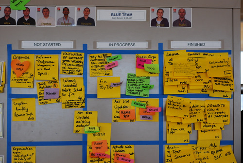
Blue team board

A good way to eliminate the need for extra columns is to use status tags.  For example, instead of adding a “To Validate” column, we can solve the same problem with a PLEASE TEST status tag that you stick on the task. Practically any sub-state of “In Progress” can be represented by these status tags; which are smaller, less intrusive and more flexible visual elements than columns. They are also color-coded which makes them even more powerful from the visual perspective.

So unless you’re into Kanban and you really know what you’re doing, I highly recommend you stick to the basic 3 columns. (And we’ll discuss Kanban another day, because I think status tags and the 3 columns might also be applicable there. For example, you can limit work in progress by limiting the number of available status tags.)

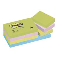
Status tagsThe Post-it’s I use for status tags are product number 653, 51 x 38 mm in size. I use two different color sets, that gives you around 6 total usable colors (there is some overlap between sets). I also put a very small piece of Scotch Magic tape on the top, because they are not Super Sticky.

The status tags I use will be discussed individually in separate posts.