Status tags are my preferred approach to visually attaching state metadata to work items.
In plain english, what this means is that if you have a task, represented for example by a standard size Post-it, you would add a physical tag, represented by a smaller colored Post-it, to indicate it has some particular status, such as “Blocked” or “Delegated” or “Bug” or “Please Test”. This creates visibility and awareness and enables the right people to react to that new status fast.
A visual alternative to tagging is creating special columns or specially designated areas in your taskboard that fulfill the same purpose.
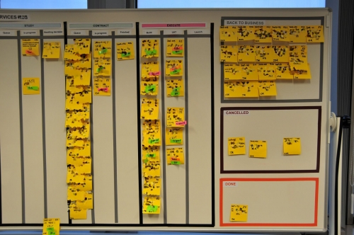
While this is valid, and many people do it, I much prefer tagging to that approach. Taskboard real estate is expensive. If you start creating special areas or columns for each status a piece of work can have, you might quickly fill your Taskboard with empty zones. Furthermore, changing the structure of your taskboard is cumbersome. This might limit the number of status areas you create. Too many areas and columns make people think about waterfall processes, even if they are not meant to be used. For example, look at the picture of the following kanban board:
While it looks good because it was done with care, there is much wasted space in those columns and boxes. And let’s take a closer look at those separate areas at the right. In this example we see a “Back to business” box. What if this status is very temporary? In that case, you are probably better off tagging it. Creating the box has allowed work to accumulate there, unchecked. Are all those post-its supposed to be going back to the main board? Someone is going to be spending some serious time moving post-its back and forth…
Another example: let’s assume a task that involves coding but is functionally testeable is being developed. During the same day the following happens:
- A developer starts and finishes it
- Someone else tests it and finds a bug
- The original developer fixes the bug
- The task is re-tested and this time declared “done”.
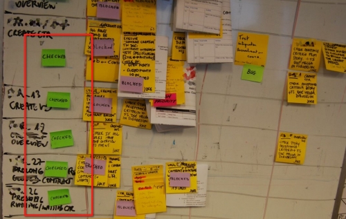
This is a typical scenario in Agile teams. If you have separate columns for “In development”, “To validate”, “Defect found”, you are going to spend the whole day moving the task around columns. People might lose track of where the task went (well, not really – but it does require more effort to locate it). I prefer the much simpler solution of leaving the task in place and rotating status tags on top of it. Another advantage: if it would go through this code-test-bug-fix cycle many times, you can place status tags on top of others, creating a “traceability” effect. With columns, you can’t do that.
Tagging is very flexible. There is no limit to the number of tags you can create. Some teams create temporary tags for special occasions. In the example above, the tag “checked” was created specifically for the occasion. This can be done quickly and easily by the team by their own initiative. Almost no work is required and suddenly your visual management process includes a new status.
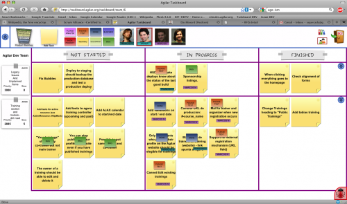
I think the elegance, flexibility and visual appeal of using colored tags for indicating task status cannot be denied. Even in a software tool, it looks good, as the example below shows.
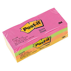
For physical taskboards, my preferred tags are Post-it 653 which come in many different colors. They are the 1.5″x 2″ small ones.
Important detail: if you just stick this small post-it onto a bigger one, it will not stick, it will fall off almost instantly. That’s why I use a small piece of Scotch Magic tape with each status tag. See the first picture in this post for a detail.

-
I agree that ‘tagging’ works better than placing a card in a specific position.
I believe that tags are a good way of tracking ‘orthogonal’ data or ‘metadata’ of a card.One way I plan to use tags is to track reword on a card. For example to track when a feature/card is returned to development from the QA team (we have function-based silos in our environment as opposed to delivery-based cross-functional teams). This way, we can track how often cards are bouncing back and forth between QA and development.
My reasoning for this is I don’t want to move the card to a different area, because the activity (development) is the same, I don’t want to create a new card because its the same item of work, but I still want to track the bouncing.
I suspect that there is an issue with ‘done is done’ and upstream specifications, and want to make it very visible that work is bouncing back and forth (one of the goals of Kanban Boards is visibility).
Typically, my cards are bigger than a post-it. On each post-it used to signify rework, I would include a short description of the ‘bug’ or reason for rework.
Pawel Brodzinski and I discussed some of this in the comments to his blog post: http://blog.brodzinski.com/2010/01/kanban-story-throwing-sticky-notes-out.html
-
To be honest I prefer simple solutions over complex ones. Tagging board items is fine as long as you don’t need to retag every sticky note few times a day.
I understand “blocked” tag shines red and tells everyone that something is screwed with specific MMF, but should I put a tag every time I find a bug? And retag sticky note every time a bug is fixed?
Actually I prefer to keep Kanban board on a bit higher level. To check which bugs aren’t fixed we use bug tracker. To call a blocker we use our mouths: “hey, can’t go further with test on a feature X, please fix it ASAP.” And a columns we use are general enough that we don’t need to push cards back and forth between them as folks find bugs and fix them.
We use tagging to show who works on what, but adding small stickies supported with Scotch tape would be overkill. I prefer color magnets we put on our cards since they’re easier to use. Each team member has their own color so everyone instantly see who works on what. As a side effect magnets prevent cards from falling off.
-
Instead of tagging I prefer assigning the task to a person who has to do the next piece of work within the task and adding a comment if necessary.
In work I use online board http://kanbantool.com -
Pingback from Resources for value stream mapping « kanban.la on July 1, 2011 at 9:28 pm
You must be logged in to post a comment.


6 comments
Comments feed for this article
Trackback link: http://www.xqa.com.ar/visualmanagement/2010/01/status-tags-revisited/trackback/