This is my recount of my session at Agile 2009 Chicago. It was titled “Visual Management for Agile Teams” and was part of the Manifesting Agility stage.

The session went well, around 36 people came and left 27 session reviews. Many people found value in the practical, down-to-earth approach of the workshop, leaving comments such as “excellent hands-on demo”, “extremely applicable information”, “finally something hands-on practical” and “very helpful”. Review averages were: Met expectations 4.4/5; Would recommend 4.3/5; Presentation skills 4.1/5; Command of topic 4.6/5; Matched description 4.4/5 and Overall 4.4/5.
I changed the format and structure of the session a little bit. First I gave a short presentation to introduce the topic. I was nervous and it showed… I’ll do better next time. We quickly moved on to starting the workshop itself. Each team was given a bag of office supplies and a blank taskboard. They set themselves up around a table.
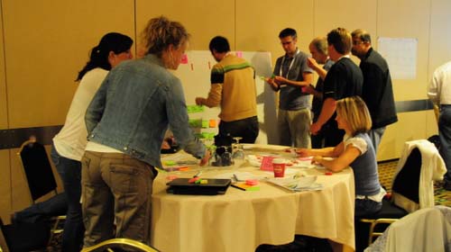
The format of the workshop is simple: teams have to build taskboards, following some guidelines such as “the boards must show who is working on what”. The first round gave teams 20 minutes to figure out what they were going to do and how to implement it. Here is the red team getting busy:

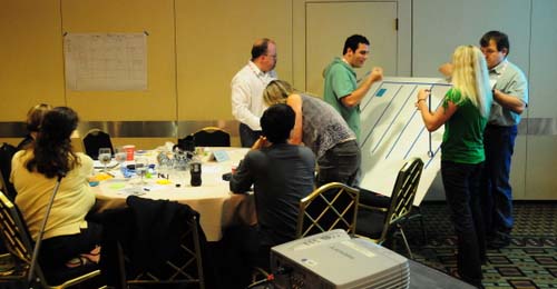
The blue team had a good idea: they did a rapid prototype on a paper on the wall, and only after that started building their taskboard.

More taskboard building:
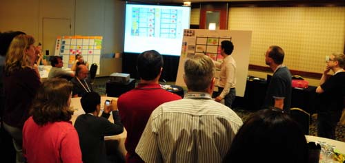
After a first round of taskboard building, people spread out to review other team’s boards.
Some stayed behind to present and defend their boards…
Finally, we did another round of taskboard improvement with new requirements, and another review session. To close, I presented my own version of the taskboard that I had built the night before in the hotel room.
Results
These are the final taskboards of all four participating teams, with comments. Click through to see a larger version of each taskboard. My comments are meant to show how each team approached a certain problem, the idea is to point out to the reader the different ideas that emerged.
Blue team
- They found and put up some team pictures. They used them to assign a color to each member and used colors as nametags. The only problem with this is that with a larger team you will run out of colors.
- They created an “URGENT” swimlane for expedited work. It is clearly distinguishable with a different color tape and a header. It is at the bottom, but they said during the workshop that if they would have had more time, they would have refactored their taskboard and put it at the top. Very good solution.
- They used red stars to indicate all impediments. I’m not so sure I would use this, as stars connote something good to me. But you can certainly see impediments clearly.
- They re-wrote their story cards in big blue post-it’s; other teams simply stuck up the printed stories.
- They put columns for “QA” and “Done Today”. In the QA column there is a single small yellow post-it that says “BUG”. No idea where the bug is though.
- Each story has tasks of a different color. There does not seem to be any significance to this other than visually pointing out that tasks belong to different stories.
Red Team
- They put their project backlog on the leftmost column. From there, they can “pull” stories into the Sprint backlog. When an urgent story came in, they placed it on top.
- They have a column “WIP Blocked” and next to it “WIP”. Another column is called “Done today”.
- They have a calendar that shows at what moment during the week they have Planning, Retrospective and Release. This allows me to see that they do 1-week iterations.
- They used different colored post-its to indicate different types of specialist work. This is a very good idea (where it makes sense). In the bottom right hand corner is the color legend.
- They did not use the red electrical tape to make their swimlanes, instead opting to go for a blue masking tape. This makes it harder to identify them as the red team.
Yellow team
- I like how this team kept their board “clean”, in comparison with other teams. Also, they put the most effort into making sure their swimlanes were tidy.
- They have only 3 columns, yellow post-its and few elements, keeping the board clean and uncluttered. It is much more relaxing to look at.
- They used red stars as nametags. Each star has the name of a team member written on it.
- They used small green post-its as “DONE” tags. They put their DONE tasks on the Complete column, so during the daily standup all they will do is remove the green tag I assume.
- They move finished stories to the 3rd column together with all the tags. For some reason, they finished the least priority story first. They seem to be working on everything at the same time.
- Pink post-its indicate a special situation is happening with that task.
Green team
- The first thing you notice is that this team opted for no horizontal swimlanes. This makes the board lighter and cleaner, but might cause confusion as to where tasks belong. To compensate, they gave each story different colored tasks as we saw the Blue team did before. This is an interesting design alternative to consider.
- Another original idea is the use of Post-it flags as status indicators with a clear legend on the lower right hand corner. Some examples include “defect found”, “retest”, “urgent” and “blocked”. This is the first time I see it and I want to say that it is an interesting idea. The Post-it flags are unobtrusive and easy to detach. I will add Post-it flags to the Elements of Taskboard Design page.
- They also have the Product backlog on the left-hand column and pull stories into their WIP backlog like the Red team.
Xavier’s board
For completeness, here is my board. The only new thing if you follow my blog is that I decided to use pink post-its instead of yellow post-its for normal tasks, simply for effect. But I didn’t find any value in it and actually the pink color is too noisy. So I will definitively stick to yellow (there are economic reasons for using yellow for tasks too – yellow super stickies are cheaper)
Conclusions
I want to thank all participants for coming to my session. I think the session was a success, and each team left me with new ideas and lessons learned.
- From the Blue Team, I learned I can create a priority swimlane which is visually clear.
- From the Red Team, I learned to use colors to indicate the nature of work. This could be used to visually identify the need for more specialists for example.
- From the Yellow Team, I learned the value of keeping it simple and clean. Overloading your board with elements and colors creates visual saturation and is tiresome to the sight.
- From the Green Team, I learned to use Post-it flags as status tags. They are small, elegant and unobtrusive.
I also wish to thank the following friends who helped me out: Mark Levison for all the advice before and during the conference, Karl Scotland for helping me during the session and for motivating me, Dan Mezick, stage producer, who came to visit during the session and seemed to really care about the quality of his stage; Tobias Mayer for always supporting me; and above all my sweetheart Joke Vandemaele without whom I would not be able to do any of this.
Thanks to you all!
PS: If you missed this session and would like to attend, I will be doing a short version of it at the Agile Eastern European Conference in Kiev next week. Registration for the conference is still open!

It will also be presented at Agiles 2009 in Florianópolis and at XP Days Benelux 2009. See you there!
-
I like the way you set the session. Demos is just the best way to understand the theory.
We will try in our company some ideas the teams got to help Visual Management.Great post, Great session
-
Great post, great session… I guess because wasn’t there ;(
Could you please post the requirements you set for the demo?
thanks!!
You must be logged in to post a comment.

3 comments
Comments feed for this article
Trackback link: http://www.xqa.com.ar/visualmanagement/2009/09/visual-management-workshop-at-agile-2009/trackback/