In Visual Management for Agile Teams, I discussed the importance of usability and good design when building our taskboards. Today I want to focus on how we write our tasks, and try to make a case for increased readability.
Readability
Readability is defined as “how easy it is to read something”. There are two meanings, as in “a readable handwriting” and “a readable book”. In this case we will focus on the first definition as it applies to answering the following question: how easy is it to read the tasks on our taskboard?

Readability will always be somewhat subjective: what could be perfectly readable for me, could be unintelligible for you. But let’s try to agree on a general readability acceptance criteria. I propose the following:
Tasks should be easily readable and understandable by a person with normal sight from a distance of around two meters.
Why two meters? Because it is a reasonable (maximum) distance from the board you can expect people to be standing at during the daily standup meeting, and when passing by.
In order to achieve this, we have to comply with two simple guidelines:
1) Small amount of text: tasks should have no more than 10 words, as a rule of thumb.
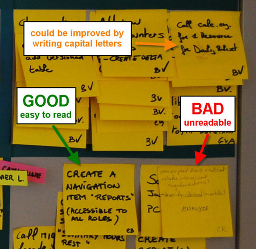
2) If handwritten, text should be written in big, bold, capital letters.
Avoid documenting
Tasks should have no more than 10 words because fitting more text into a 3×3 inch (76×76 mm) standard Post-It forces you to write too small, and we want to avoid that. But there is also another reason. You shouldn’t need to write a lot of text if you understood the nature of tasks and how to use them in your process. Tasks are meant to be pointers to the work that has to be done. Reminders. Not a full analysis or description of what has to be done. The goal of a task is to represent a unit of work. The details of the work should be in the person’s head, having been discovered and defined by having conversations with the other team members. We should avoid documenting tasks on the post-its as much as possible. We should also avoid using sticky notes as “documentation hand-offs” between team members.
The reason for using bold letters is to increase readability of the text. Bold is required because of the distance we want to read from, and the size of the font we want to write in. Writing 10 words on a standard post-it in ballpoint pen in a text size that fills the post-it would result in a font that is too lightweight and disproportioned. Most likely what will happen is that people will write the 10 words in a very small font, thus rendering it illegible from the required distance.
The reason for writing in all capital letters is that lots of people have bad handwriting, or write in cursive when not writing capital letters. This makes a task difficult to read even if it complies with the 10-word rule and is written in big bold letters. We are not trying to learn to decipher your doctor’s handwriting here, thank you. See above example in orange.
Readability creates transparency and trust
Readability of tasks is cornerstone to generating and sustaining the feeling of transparency and trust that taskboards have the potential to transmit. To achieve this, the taskboard has to invite to be read. Avoid the following readability anti-patterns:
- Difficult to read handwriting
- Small text
- Text written in ballpoint pen or pencil
- Text written with colored markers.
- Text written with whiteboard marker or dried up markers.
Read it from your desk
If tasks are readable from two meters without effort, they might also be somewhat readable from a distance of up to 5 or 6 meters. If the taskboard is in the work area, chances are most desks will be located within this radius. This means that team members might be able to read the taskboard from their desk, something desirable. As an example, in the picture below, most desks are within reading distance of their taskboard.
The thick black marker
A black permanent marker with a rounded tip is the only writing tool you will need. If you take care of it well (you close the lid carefully and don’t press too hard on the tip when you write) it will far outlive your project. They are also very cheap and it is not unreasonable to give one to each team member.
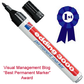
There are several brands in the market. I have tested many of them and my top recommendation is the Edding 3000 which I can get for around €1 a piece here in Belgium.

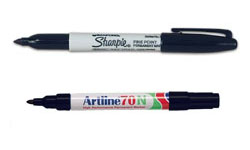
Top contenders and good substitutes are the Sharpie classic and the Artline 70N.

What you are looking for in a quality permanent marker is:
- rich, solid black ink
- ink dries fast, doesn’t smear
- doesn’t bleed on Post-it paper
- lasts long
- cap fits on the back (so you don’t lose it), and is easy to open and close
As an extra, the Edding 3000 and some other brands come in a mini-marker version which is ideal for the purse of the lady Product Owner or the pocket of the gentleman Scrum Master. ![]()
-
Xavier,
Maybe some next ideas about building ‘green’ or environment-friendly whiteboard and tools? Those markers are really ugly… -
So what are the best whiteboard / dry erase markers?
-
For people in the USA:
For writing on flip charts, I prefer the chisel-tipped, water-based Mr Sketch or Neuland markers mentioned above.
For writing on sticky-notes (super sticky post-its, etc.) or index cards, i hand out Pentel Color Pens (fine point fiber-tipped marker) in black and/or prussian blue. They are as readable as Sharpies, yet are non-toxic, dry instantly, and don’t bleed through the paper to mark the underlying notes. And less expensive. I purchase them in boxes of one color from http://www.artsuppliesonline.com/catalog.cfm?cata_id=1901. When you use these markers on notes, the notes are still recyclable.
I haven’t found any whiteboard/dry erase markers that meet my standards. All I’ve found so far are barely adequate. There are some that claim to be low scent or non-toxic, but I know people who still get headaches from them.
You must be logged in to post a comment.

8 comments
Comments feed for this article
Trackback link: http://www.xqa.com.ar/visualmanagement/2009/07/readability-and-the-thick-black-marker/trackback/