Visual management is not just about having visual elements, how you use them is equally important. A bad process can render a good idea useless. And some trivial ideas, with a good process behind them, can produce interesting results.
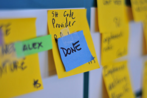
The DONE status tag is a process related idea. It is a creative way to visualize flow, give teams a moment to celebrate their achievements, and to ensure team alignment and communication; all on a daily basis.

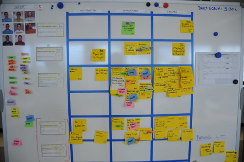
The concept is simple. During the day, team members work on tasks that are in the “In progress” column of the task board. When they finish a task, instead of immediately moving it to the “Finished” column, they slap a DONE tag on it. And there it stays for the rest of the day, broadcasting to the world that the team has finished some work. This is the flow part: at a glance, at the end of the day you can “see flow” by scanning the boards for DONE tags. The more blue, the more flow. Managers and Product Owners like this.
The celebration part comes during the daily standup. Here, the team gets to move all their DONE tags to the Finished column, creating a small daily moment of pride. Naturally it should be the person who finished the task who talks about it and moves it.
What about alignment and communication? By moving all DONE tasks at the daily standup, you basically ensure that everybody in the team is aware of what is getting finished and by whom. This is actually how the idea came up. Team members were moving tasks to Finished during the day, and then at the daily standup they would forget to talk about stuff. With lots of tasks in the Finished column, it was getting difficult to remember which ones were new from the day before. And if you have One Day Tasks, believe me, this is going to happen, especially with the most prolific developers who get a lot of stuff done. The idea was to come up with a foolproof process that would guarantee people would talk about everything they finished the day before without requiring a special effort on their part. This worked, and people liked it.
So the general guideline for using the DONE tag is:
- You should only move tasks to the Finished column during the daily standup.
- You should only move tasks that have the DONE tag on them and you did yourself.
- Once you move them to the Finished column, remove the DONE tag.
Another curious thing I discovered is that sometimes team members forget to talk about something they finished the day before, even if it is in the “In progress” column and has a DONE tag on it. But in this case it is easy to detect: if after the daily standup there are still DONE tags remaining, either they forgot to talk about it, or it was done by a team member that is absent that day (in that case, unless he went on holidays, teams normally wait for him to come back so as to not steal his achievement).

Can you quickly spot the DONE tasks?
Why blue tags?
The truth: no special reason. I just randomly chose a nice looking color. But then I found out that blue represents “good” in japanese, so -being these tags a Lean idea- this actually gave it some meaning. (For the curious: I learned this through a lengthy debate with Kohsuke Kawaguchi, the author of the Hudson CI engine. Hudson displays a blue screen instead of a green screen when the build is OK.) Blue also has very good contrast with yellow, making it easy to visualize finished tasks from afar, as you can see in the above picture. But there is no special reason for blue, and I have seen that some teams prefer using green for DONE.
-
Thanks Xavier
Now the article is available in Russian:
http://www.scrum.com.ua/2009/06/done-tag.htmlWe will keep translating this good stuff.
You must be logged in to post a comment.

5 comments
Comments feed for this article
Trackback link: http://www.xqa.com.ar/visualmanagement/2009/03/the-done-tag/trackback/